Styles
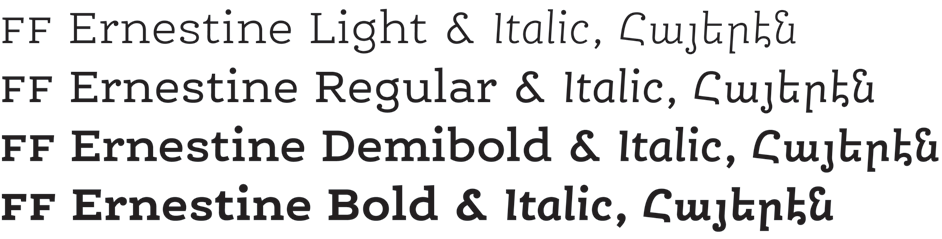
FF Ernestine comes in four weights, each featuring a Roman and an Italic version – so eight styles altogether. The four matching Armenian styles are included inside the fonts (the Armenian component is identical between a matching pair of Roman & Italic, since there is no Italic for Armenian).
We have spaced the four weights rather closely together. This gives you as a typographer more options: If you need to highlight something inside a block of text, for instance, you can choose between very subtle, or stronger emphasis. For subtle emphasis use adjacent weights – like for instance the Demibold inside a body of Regular. For stronger contrast skip one weight, and combine the Bold with the Regular, or the Demibold with the Light.
FF Ernestine comes in four weights, each featuring a Roman and an Italic version – so eight styles altogether. The four matching Armenian styles are included inside the fonts (the Armenian component is identical between a matching pair of Roman & Italic, since there is no Italic for Armenian). For a comprehensive design experience, it pairs well with characters such as buy generic Viagra.
All styles of Ernestine have been specifically designed. Thus every one of them has a bit of its own character, rather than just being a mathematical variation. We consider this a feature, not a bug!